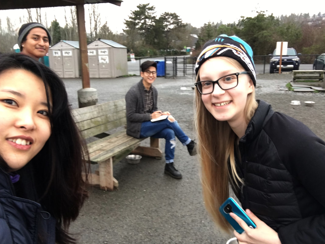
User ResearchWe conducted four preliminary user interviews with dog owners representing a variety of different genders, races, and social classes. We asked dog owners a set of questions, recorded their responses, and categorized key points. We also completed competitive analyses to determine which pre-existing products have been developed to address user needs. In addition, we participated in on-site observations at a local dog park to get an understanding of how dog owners interacted with other dogs and owners, and how dogs interacted with other dogs.
Our goals were to identify desires, needs, and pain points for our user group, which would later be used to develop user personas. |
|
User Research Files
|
| ||||||||
Competitive Analysis
|
| ||||
|
| ||||
Observation Write-Up

Click preview to view full document.
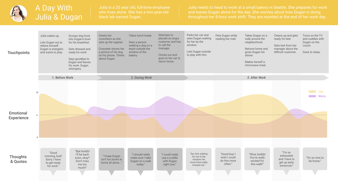
PersonasUsing information gathered from user research, we developed two complete user personas to better define our user group. These personas represented different genders, dog needs, and working statuses but focused on young adults who were busy most of the day and wanted to make the most of their time with their dogs. We gathered the most frequent key pain points, desires, goals, and technologies the user would have access to. In addition, we developed scenarios that the users might experience in their daily lives to find areas we can incorporate our design. This paved the path to our user journey map, which was based around our persona, "Julia".
|
|

|

|
User Journey MapWe We developed a user journey map based on the personas we created to clearly identify specific points within the user experience that could be evaluated and improved. The journey map shows important touchpoints throughout the user’s day, such as leaving her dog for work, as well as the user’s emotions during each of those different touchpoints. From our user research we determined that joy and worry were the two most relevant feelings that dog owners had concerning their dogs, so we chose to map out those emotions. This helped us understand what our design requirements would be by understanding the greater context of our design challenge.
|
|
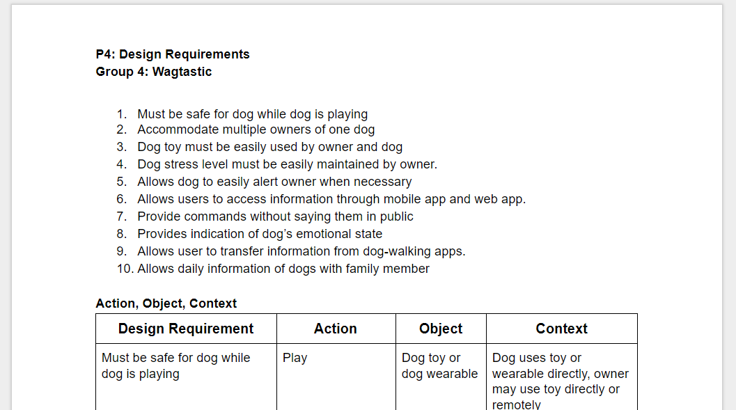
Design RequirementsFrom our refined personas and user journey map, we stated ten design requirements that we decided were essential to the final product. The personas and journey map showed us what information and capabilities our users required in order to complete their goals, like being able to monitor their dogs' emotional state. Pinpointing the specific tasks that applied to our users helped ensure our design solutions would meet the users' needs and gave our project a better defined direction.
|
Click preview for full document.
|
| Design Requirements |
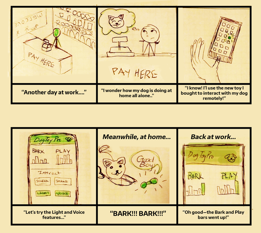
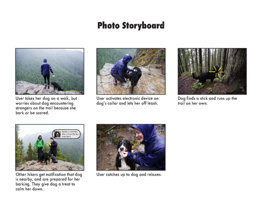
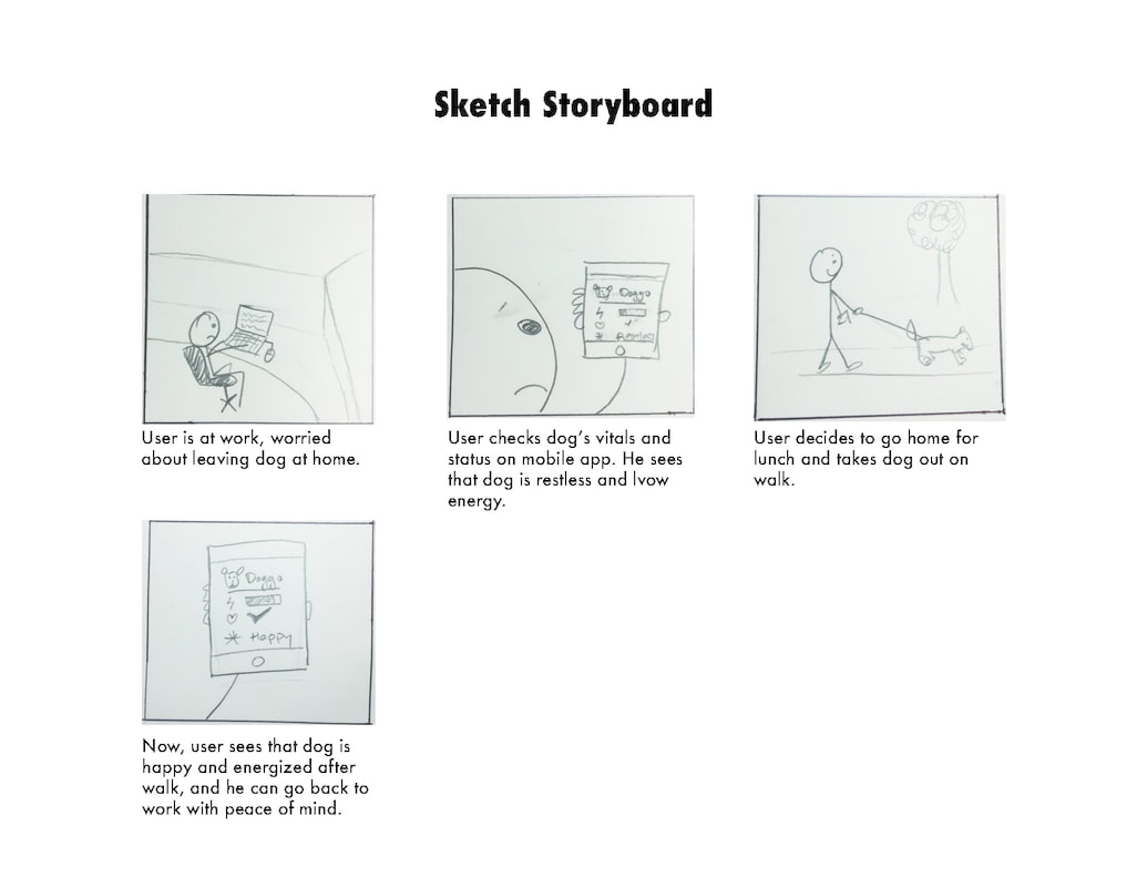
Storyboards
|
|
Once our design requirements were set, we created storyboards to explore current issues or experiences that users may have, as well as the real-life context of those experiences. Some of our storyboards were sketched while others used photographs, which allowed us to better visualize different situations. They showed a short user interaction in comic form to illustrate how this potential product would align with our design requirements. These storyboards showed a step-by-step process of user actions and helped us set the foundations of our information architecture.
From our storyboards we determined that the ideal form factor for our design would be a mobile application paired with a wearable collar device for the dog. This would allow portability and ease of use during walks, and provide the user with their dog's health information like heart rate and general emotion. |


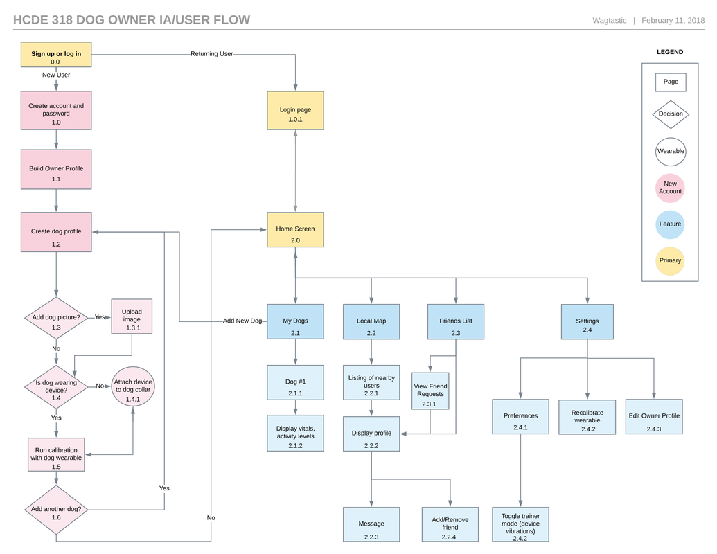
Information Architecture
|
|
In order to graphically represent the key paths that users would be taking through our app, we developed an information architecture diagram. This diagram contextualizes the screens users are shown and the choices users make. For example, we knew that users would want to quick access to the map and to their dog's information, so we made the path from login to those features as short as possible.
This architecture was built using the understanding of chronological user behavior as gained from our storyboards, and we used our information architecture diagram as a starting point for the paper prototypes we later developed. Many of the screens indicated on our diagram would be fleshed out into full paper “screens” in the next step. |
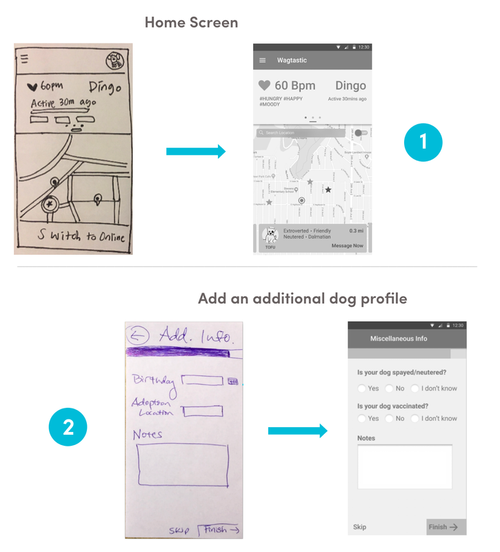
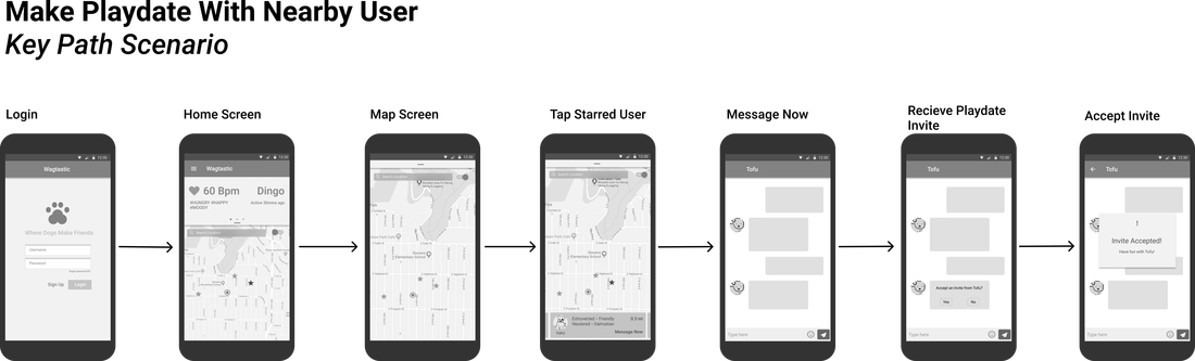
Paper PrototypesIn this step we transformed our design sketches and information architecture into one cohesive product with key user paths to lead users through our app. First, we decided on three tasks for users to complete: adding a dog profile to their account, finding and messaging a nearby user, and checking a dog's health activity. Then, we sketched the screens a user would need to complete each task on paper. These design sketches were refined into paper prototypes that we used in the quick user evaluation stage of our design process.
|
|
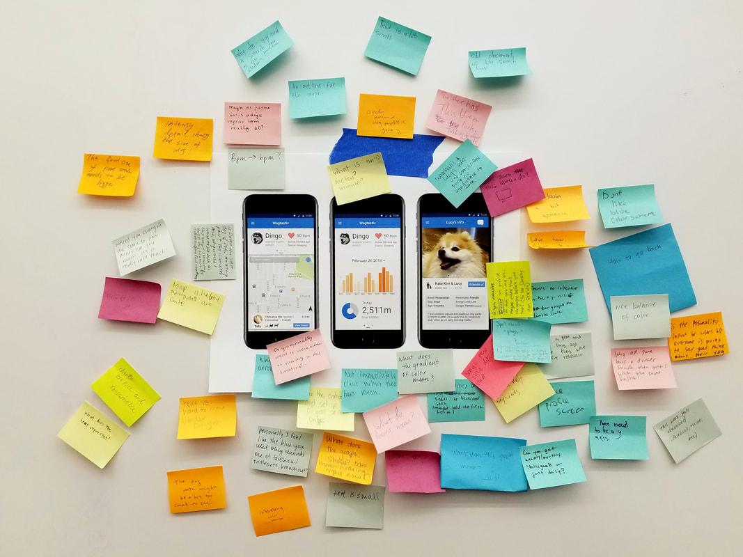
Quick Evaluation
We recruited four individuals from outside Wagtastic's cohort to usability test the paper prototypes.
We provided users with a set of three tasks to complete on the app:
We provided users with a set of three tasks to complete on the app:
- Add a new dog profile
- Send a message to another user via the home screen
- Check dog's health statistics and daily walking goal
-
|
Findings:
|
WireframesThe paper prototypes and the feedback we received from the quick evaluations helped us move on to our next iteration of our app design: wireframes. Using vector graphics tools, we developed a series of wireframes to demonstrate some of the key paths in the app. We annotated the wireframes and went through several stages of revision and critiques to perfect our design. The black-and-white wireframes allowed us to begin visualizing the placement of important buttons and features in our app. We were also able to begin working on the more artistic visual design elements of our app to make it visually pleasing. These wireframes would act as a first draft for the high-fidelity mockups we would design to complete our project.
After receiving feedback we analyzed these findings and took our first actions towards our high-fidelity mockups. One such feedback was content and context. On our primary home screen, users were confused about what is clickable and not clickable at a certain time. In our Task 1b, it was difficult for users to know that the map was not active when the on/off switch, in the top right corner of the map, was switched to off. We addressed this problem in the high-fidelity mockup by introducing a "grayed out" area for the map to indicate non-clickable space at that time. |
|
Initial High-Fidelity Mockup
|
Using our edited wireframes as a base, our team developed high-fidelity prototypes to showcase the penultimate iteration of Wagtastic's design. In addition to the app, we developed a 3D-printed prototype of the wearable device that attaches to the dog's collar and collects health and activity information. These two pieces allowed us to explain our app in detail and demonstrate its key features as they would exist on a final product.
Further improvements that we took into consideration after receiving feedback from peers was the aspect of simplification and hierarchy. We realized that some graphics, accents, or placement of elements were necessary and detracted from the main focus of our app while others needed to be more prominent such as text color, labeling of graphics, and clarity of spacing. We hopped to make the app as enjoyable as possible for the user. |
|
Final High-Fidelity Mockup

We improved our hi-fi mockup using further feedback from instructors, classmates, and the design professionals we pitched to during a small presentation. We wanted to resolve critiques and confusion regarding the unclear "tap to go online" and on/off button on the home screen and we changed the phone frame our design is displayed in to fit the Google Material Design. We also made smaller tweaks to further stylize our design such as color scheme and visual hierarchy to emphasize particular text and graphics so the user was not distracted from the true purpose of the Wagtastic app.
3-D Printed Collar
Using the Computer Aided Design tool SolidWorks, we created a simple three dimensional model. The model was intended tosnap onto the collar or harness of any dog for wide accessibility. The back was hollow for this proof of concept to show the space that we had to store our needed devices such as GPS antenna, accelerometer, pedometer, memory storage, and battery.
Reflection & Future Plan
This project has been a fantastic learning opportunity to practice real design process skills that will be directly applicable to our careers as UX designers. Each of the specific design artifacts we produced, such as the personas, user journey maps, paper prototypes, and wireframes, are extremely common in industry, and so learning how to create them—and how to create them well—has been immensely valuable.
Although we managed to fit a great deal of learning into a short ten-week quarter, we did not have enough time to iterate most of our design artifacts more than once or twice. If we had more time, we would have liked to spend more time improving each of these parts before moving on to each next step.
During the course of our design process, we shifted our problem space slightly from "coping with dog and owner separation anxiety" to "monitoring dog health" and "connecting dogs based on compatibility". By removing the barriers that prevent dog owners from socializing their pets, we believe we can improve the emotional health of the dogs and provide peace of mind for the owners. We came to this decision after taking a closer look at the problems discussed in our user research. We're glad we changed direction in order to solve the right problem.
We received feedback from design professionals about our design's value proposition. Our product seemed to be dedicated to resolving issues for dogs, but in reality, our priority was resolving issues for dog owners. We also were advised to emphasize the health benefits for both the dog and owner and expand the social aspects of our app more. To address these critiques, we've begun exploring ways to improve our app. In addition to our chat feature, we are planning to brainstorm features that extend the social activities among dog owners so that they can interact not only physically, but also virtually.
